Chicago Comic-Con Commissions
August 28th, 2018 | Posted in General
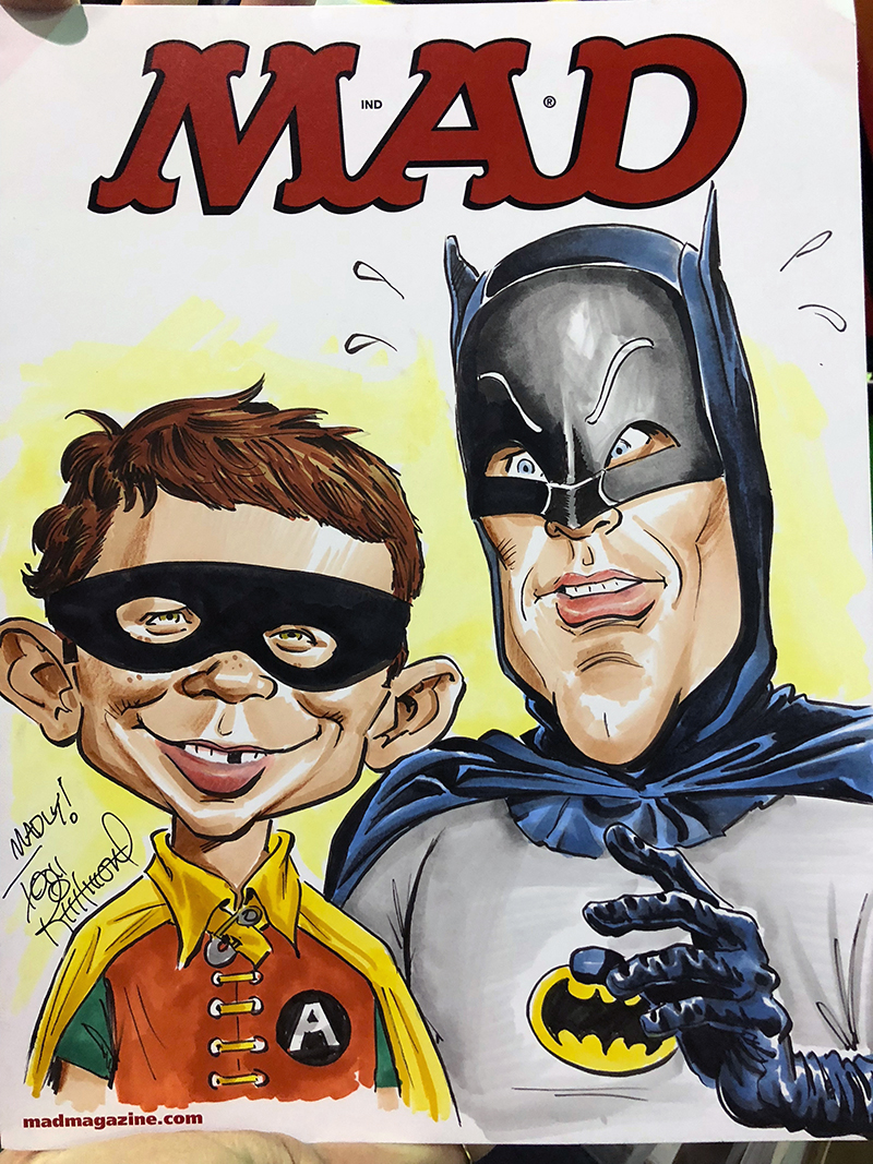 Here’s a look at a handful of different commissions I did last weekend at the Wizard World Comic Con in Chicago: READ MORE
Here’s a look at a handful of different commissions I did last weekend at the Wizard World Comic Con in Chicago: READ MORE
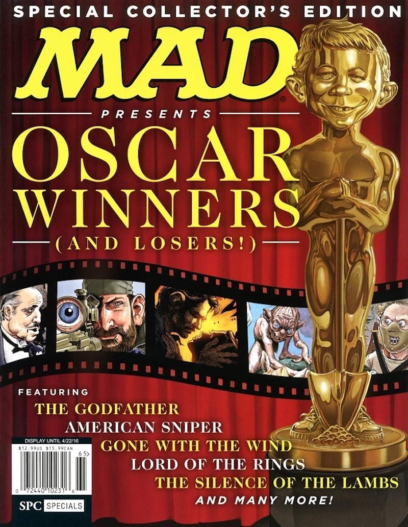 I did these cover illustrations for a couple of MAD’s “Bookazines” back in 2016. A “Bookazine” is the modern day version of the MAD Super Specials i.e. reprints collections. They are square-bound publications with heavier, glossy paper kind of half way between a softcover book and a premium magazine format, and usually follow a theme of some kind. MAD has been printing them every quarter for a few years now. You can see a list and all the covers of the Bookazine run over at Doug Gilford‘s fabulous MAD Coversite. READ MORE
 Q: Piggybacking off the previous Q and A about how you begin a live caricature — outlining the face first, or starting with the eyes, nose and mouth, then working around that — what angle do you prefer…a straight-on head shot, or three-quarter? And should one be preferred over the other, relative to highlighting features the best or one being more “dramatic” than the other? A: It depends on the face, but in most cases a 3/4 angle is most descriptive of the subject. It gives you a much better dense of depth with the face, and you see elements of the front and side… READ MORE
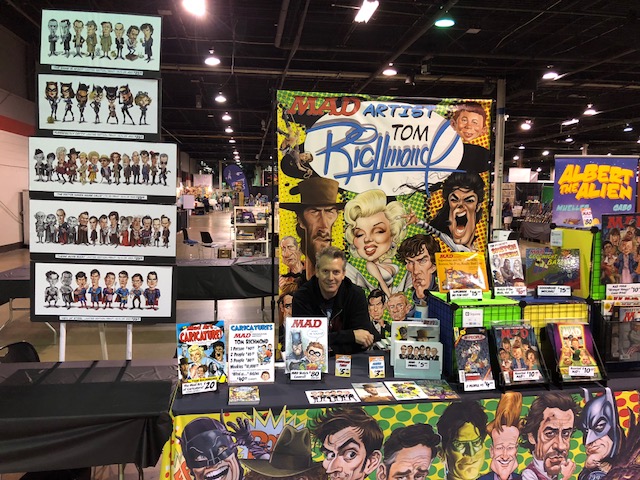 I’m live at Chicago Comic Con! Well… mostly live. Stop by if you are at the show!! READ MORE
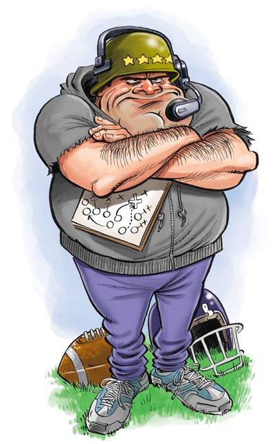 Here are some spot illustrations I did in 2011 for SI Kids. The article was about different types of coaches and I needed to create a cartoon character version of each “type” showing some of their pro and con attributes. We loosely based some of them on real coaches, but not in their facial features. Things like clothing, accessories and demeanor might remind you of certain real coaches in pro or college sports. None of them are even remotely caricatures of real people, though. Here are the final results . . . I think the details of the type is pretty self-explanatory between the illustration… READ MORE
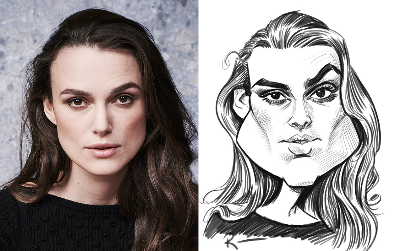 I’m still really swamped trying to play catch up after my European workshop tour, so not time for a real SotW this week. As everybody seemed to enjoy last week’s post of one of the woram up drawings we sis in my workshop in Switzerland, I thought I’d post one of the ones we did from the London Workshop. Again, these are warm ups we do before we start class on the second day, and I look up subjects that might have some relevancy to the location of the workshop. One of the ones we did in London was this one of Keira Knightely. I… READ MORE
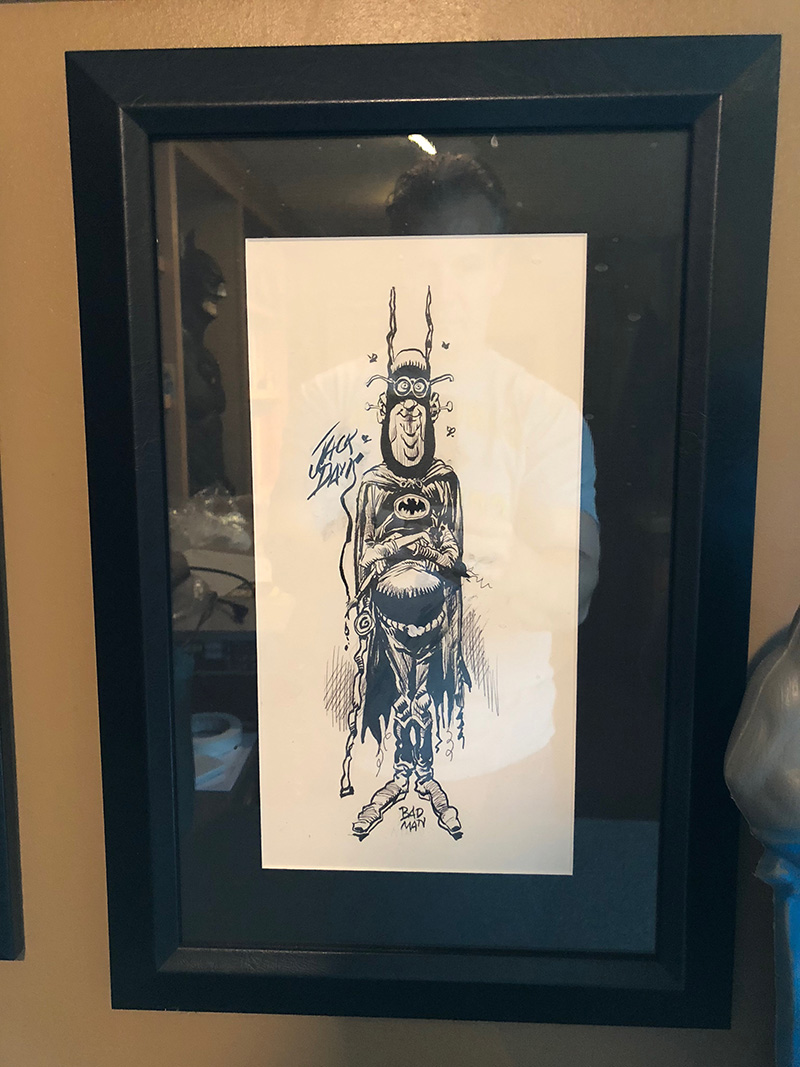 I have several really awesome pieces of original comic/cartoon art I’ve gotten over the years from friends and fellow cartoonists. This is one of my favorites because it’s Batman, it’s by the legendary Jack Davis, and I asked him to do it. Back in 2014 we were brainstorming ideas for a T-Shirt to produce for the National Cartoonists Society’s Comic-Con booth. We settled on doing one themed on Batman, since it was the 75th anniversary of the character’s first appearance. We asked a number of well-known NCS members to give us a piece of Batman art, and we received some really great ones. Here’s the… READ MORE
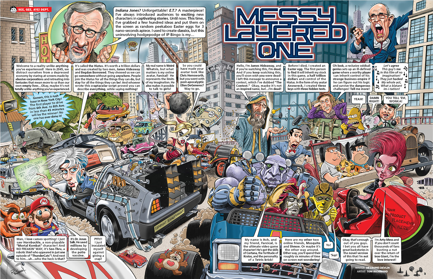 The newest issue of MAD contains a 7 page parody of the film “Ready Player One’, art by me words by Desmond Devlin. It was a very fun movie to parody but it did present a kind of unique problem with respect to the background gags or “chicken fat” that is part of what I like to add to the mix. The problem became apparent to me right away when I was working on the splash page, which was the big race scene. I was brainstorming fun background stuff to put in there, so I was thinking “How about the ’66 Batmobile! That would be… READ MORE
Sign up for Tom's FREE newsletter:


